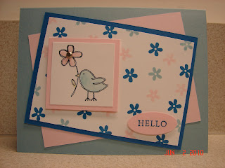
Okay, when SU first announced its major color overhaul, it took me a little by surprise. But, no big deal. Who doesn't like new stuff? And I had some of the old In-Colors that were turning into standard colors. I have plenty to work with for any swaps I participate in that require current items only. As it turned out, I have in my possession a little of all of the new colors except two. Then I started planning on what I wanted to do on a swap I have signed up for --- I would need Bashful Blue, Pink Pirouette and a pale purple. What??? We no longer have a pale purple of any kind. Not even in the new In-Colors. How could that happen? We have two standard darker purples (Elegant Eggplant and Perfect Plum) and a dark purple In-Color (Concord Crush), but no Pale Plum-ish or Almost Amethyst-ish color at all. Not even something close to Lovely Lilac or Lavender Lace. It seems to be quite a major oversight, to me. Am I missing something?
And then last night I started rearranging my cardstock and markers for the new stuff. Man, I did not realize just how many colors we were losing. Granted, alot of them I could live without (some I never really used anyway --- like Really Rust, Apricot Appeal and Barely Banana), but there are so many of them retiring. Now that I have the hands-on perspective, I am shocked. But, of course, time moves on and things change. The colors I can't live without will be replaced with new colors I can't live without --- and those colors will change over time.
So on to my card that uses some of the new colors. I needed a sympathy card for a friend of mine. These are not easy for me, kind of like manly cards. You don't want any color that is too bright, but none that is too dark either. It's a hard combo to mix, but since I had just received my new catalog pre-order (one of the demo benefits I adore) I pulled out the new cardstock I got. I also pulled out of my order the new Color Coach, hoping it would help me on a combo. And that is just what it did. I think that the new design of the Color Coach is great. So, the combo I came up with was Early Espresso (in the Neutral Collection), Blushing Bride and Pear Pizzazz (both In-Colors). I think it is a soothing mixture. The ribbon is the new Taffeta Ribbon in Early Espresso. The stamp sets are Thoughts & Prayers for the image and Close as a Memory (retired) for the sentiment. I colored the image up with my markers --- I love how we can now have a marker for all of the colors. I used the sketch challenge my sideline, Sherri, came up with for this past weekend. See it here.
Thanks for stopping by & have a Great Day!!!!!!


